Last month, we caught up with set-designer Lou Blackshaw for Nosakhari Celebrate - here's a look from behind the scenes.
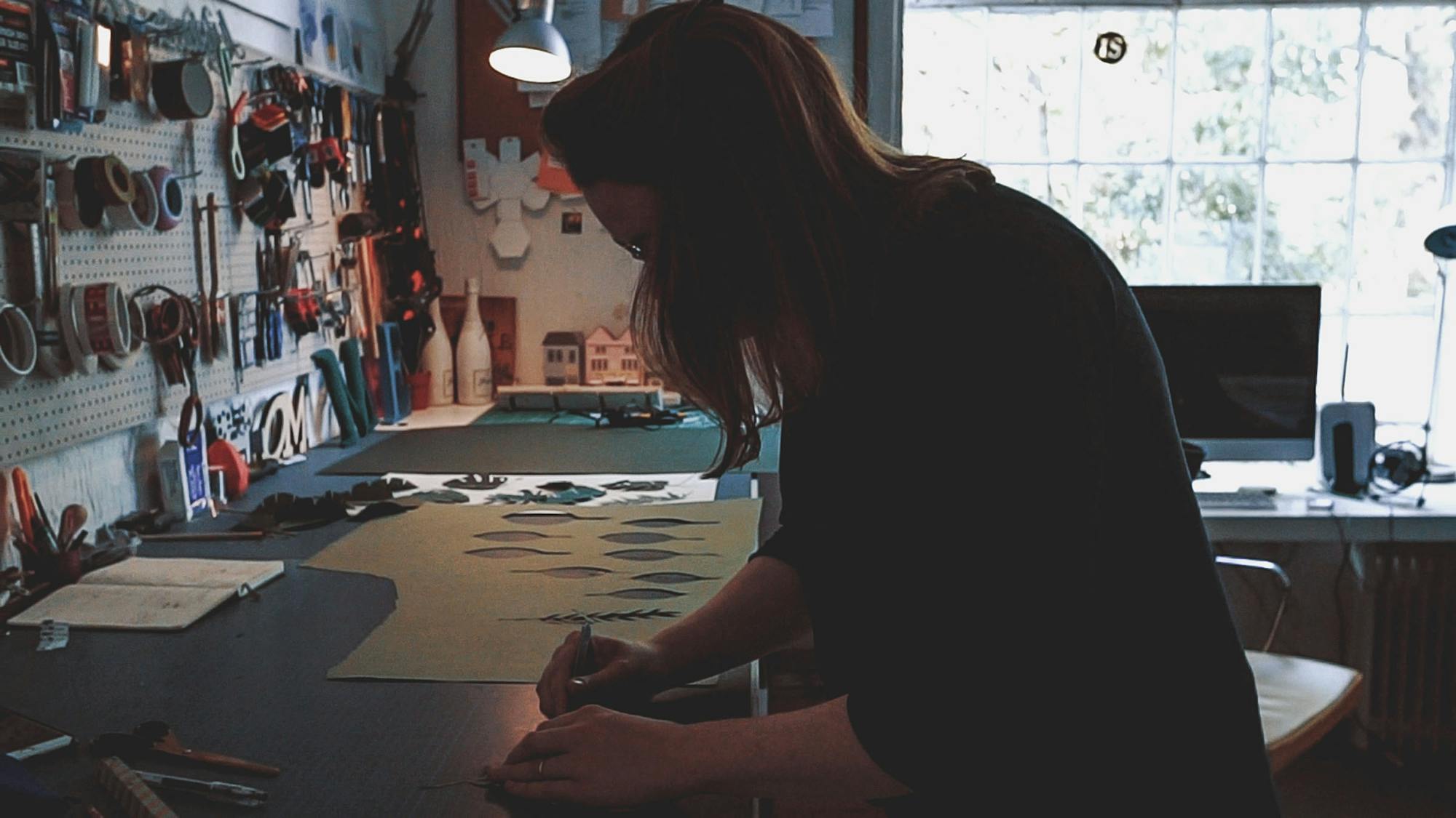
When I hurry (not quite late) into the Clapham studio where Lou Blackshaw works, the set designer is touching up her make-up. There’s a sink by the window where cacti sunbathe and a desk with an Apple Mac and coffee-stained coasters. To the left, a wall is plastered with copies of her published work. On the worktop beneath it, sheaves of folded coloured card (“I’m keeping them for a friend”) and snippets of paper are scattered below a wall-rack supporting a range of DIY tools I don’t know the first thing about. FKA Twigs plays on Spotify and Peggy the dog periodically ventures forth from the coach to face-off to the camera equipment that Adrian is setting up. I take in the work on the wall.
Lou seems fairly unflustered, and when the interview begins she’s perfectly at ease. When we get onto the topic of her inspirations, however, she’s obviously more fired up, gushing about the virtues of Hepsworth and Golding as she Google Images their work for us. Hepworth’s sculptures are famous internationally for the curves, circles and intersecting lines that explore how we interact with different spaces. You can see the same interest in placements and spatial relationships in Lou Blackshaw’s work.
While she is fascinated with spirals, circles and other natural forms, however, Lou doesn’t stick to these patterns uniformly. Her window design for Harrods imitates nature (with leaves, flowers and branches) but the flowers cut at angles into brightly-coloured polygons more closely resembled cut gemstones. Her work is eye-catching because of this contrast, as well as because of her playful attitude to colouring – there’s little of Hepworth’s dun browns and greys in Lou’s portfolio.
She’s cutting leaves from paper now with startling speed as she talks, and soon there’s an impressive pile of foliage littering the workspace. “I always seem to return to paper” she remarks, and it’s easy to see why – Lou is evidently at home with it.
“Peggy is my biggest inspiration”, she jokes (I think) as the dog fixes her doleful eyes on Adrian’s camera. Looking at her catalogue of work, I can’t immediately identify a canine influence but I can’t rule it out, I suppose. Peggy’s been scampering around throughout the interview, but is now quite happy lounging on the sofa beneath block letters commanding “Let’s Create” – much more readily identifiable with Lou’s love of creative process.
The one constant I noticed throughout Lou’s portfolio (except her love of paper as a material) is the surprising juxtaposition of curves and angles, deliberately unsettling placement that is nevertheless akin to natural forms. It’s obvious that she never settles for the functional – “Let’s Create” is a creed Lou lives by.
We wrap up the interview and Adrian plans to return to take some more shots of studio, while I attempt to surreptitiously slurp my cold coffee. Peggy gives us a doleful look as we leave, but Lou is once more business-like and beaming. It seems obvious that she can’t wait to get to work again. If there’s one thing I’ve taken away from this interview it’s the unassuming quality ingenuity can take on – sometimes, all it takes is the right question to reveal the burning fervour that powers even the quietest creative. We saw that with Lou Blackshaw’s energetic tone when discussing forms, materials, and inspirations – but her enthusiasm is also, of course, evident in her work.


